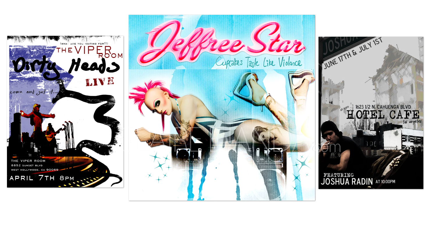
With postcard design, having to fit info into a tiny space makes it tricky to arrange the who’s, what’s and where’s. That is why it is important to utilize solid colors with purpose. Solid colors create the illusion of a larger space. It also provides invisible arrows so that key pieces of information will stand out. Here are 3 different ways that I used white space for postcard design to direct the eye. Having a purposeful solid color makes information entertaining when having artwork display information. For instance, for Dirty Heads’ “Viper Room” flier, I wanted the eyes to slither along the info like a viper would. I like being playful with my designs. I feel that more fun you have it with, the more your visual designs can trick your mind into believing that what you are seeing has inherited audial properties. That connection to audial properties makes info that much easier to retain.
Compare my approach here to poster design, where I have a larger canvas to work with. What similarities or differences can you observe?

Featured Clients: DIRTY HEADS – WARNER BROS. RECORDS, JEFFREE STAR – SAYNOW, JOSHUA RADIN