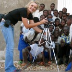
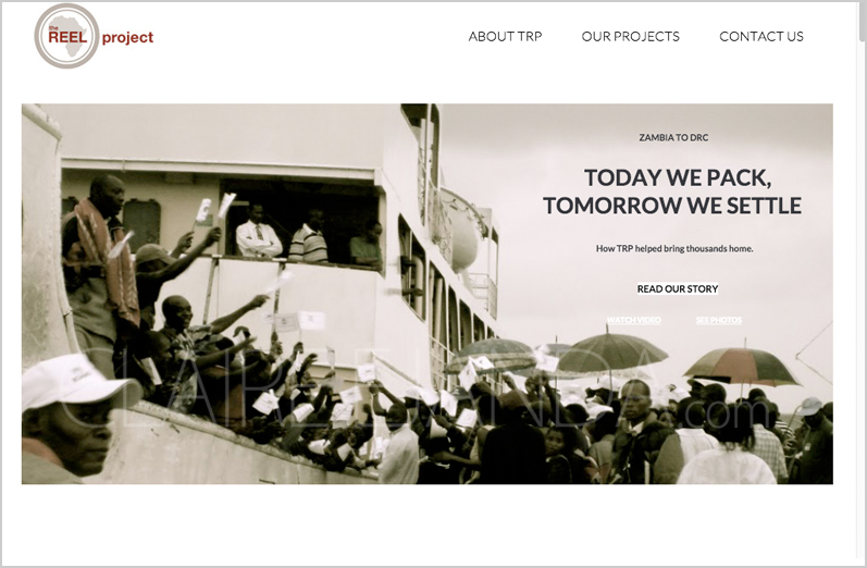
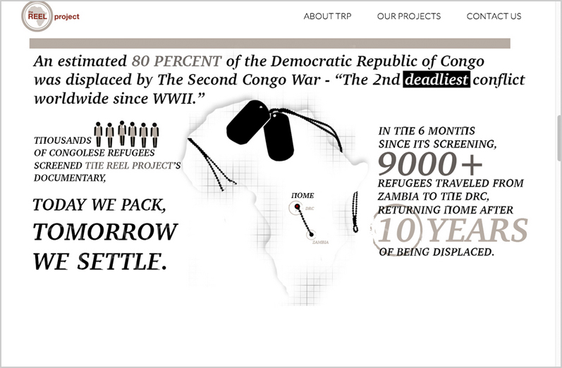
Web design for non-profit organization, TheREELProject.org. Their documentary, “Today We Pack, Tomorrow We Settle,” was filmed with 2 handheld cameras, and contributed to the return of more than 9000 refugees to their home in the Democratic Republic of Congo (DRC) – after a decade of asylum. What has made this organization special is that they not only create films to provide vital information to populations affected by violent conflict, but they also identify to assist in the crucial needs of the communities where they film.
Check out the video below to see one of the ways that The Reel Project has assisted in making a difference in the lives of the people of the Democratic Republic of Congo.
When I design for web, I try to imagine myself in my client’s shoes – telling people about ‘my’ website. What are the kinds of things that would make me speak with confidence about what I was involved with? No one wants to feel like their big idea is just a hobby and so I try to give clients a presence that motivates them to believe in what they’re doing.
I had been hired on several occasions to update page content for TheReelProject.org after helping TheReelProject.org’s founder and CEO, Krista Barnes, with a login retrieval issue. The more I got to interact with Krista, the more I became familiar with the heart behind her cause and this disparity between her and the web; her existing website had difficulty holding this tried and true cause, together. I offered a complete rebuild of TheREELProject.org to better serve their purpose and increase the opportunities of their non-profit being a life-saving one.
With a focus on clean “info”-structure, I had Krista email me all the written content from her website that she felt was still important to her. I committed myself to simplicity by making sure this information would not exceed a hierarchy of 3 levels. And from this hierarchy, to create a design that was supportive of it.
My approach for (this) non-profit website design was as follows:
1) Site Transparency. Make the front page an excerpted version of everything within the website. When people go to other pages, recalling the homepage would make visitors more receptive to what is being said. This connection would “un-hide” the website.
2) Answer Accessibility. Purposeful click destinations. The questions that arise from one page should lead to a readily available “next click” opportunity where they would find their answer. Allow for plenty of opportunities for deeper exploration into the organization so that people could immediately identify, through answer seeking behaviors, how this organization is making a difference.
3) Design for Content Expansion. That the organization of the content supports future expansion of information in a way that continues to hold itself on to the design of the site. That when users return, they know how to find new information quickly, as this predictability encourages an effective relationship.
Establishing a web design around sound “info”-structure gives the idea that it represents a much greater durability.
In addition to designing the website graphics, Krista allowed me an involvement in editing her written content for structure and style. Through a span of several weeks, I pieced together portions of her writings to ensure that if I was to create a message visually, that her exact words were there to reinforce them.
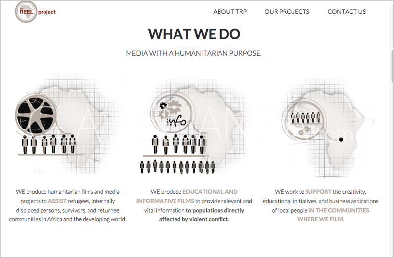
My intention for this design was to take visitors through an experience where they encounter a series of the familiar statistical icons meant represent a population.

By the bottom of the page, these statistical icons take on a form that suggests there’s more to them. That they are, in fact, an actual person. I wanted the design to end with the realization that we haven’t been looking at statistics the entire time; we’ve been looking into someone’s life.
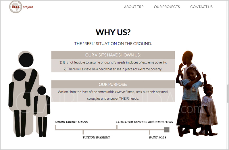
I opted for a subtle revelation to allow visitors the space to draw this conclusion on their own.
In addition to the web design, style and structural editing, the tagline of “Take Action! GIVE.” was also thought up by me to tie the elements of film (“Action!”) and charity (“Give.”) together.
Through the use of my “go-to’s” – WordPress as a content management system and the Genesis Framework to reinforce my web design – I was able to give TheREELProject.org a design that was fast and mobile-responsive.
To design something that contributes to a population’s need for compassion – there is that pressure to know that as much as you put in, the greater the chance there is for lives to be saved. This responsibility can have you questioning the quality of your efforts from day to day. So I placed a post-it on my monitor and written on it were the words, “BE MOVING.” I needed it to remind myself to make these lives important to others’ lives.
I still have no plans on removing the post-it because it puts me in constant re-alignment of my priorities. I do not want to distance myself from the emphasis I should place in my life to do, with my skill set, the kind of work that helps and heals.
If you would like to donate to The Reel Project, check out their website below. You can also choose which project you would like your donation to fund by filling in your preference in the space provided on the donation form:
Also, if you are interested in more of my involvement with non-profit design, check out my work on the “Love Kills Cancer” campaign – in support of the Leukemia & Lymphoma Society.
Featured Client: TheREELProject.org
Roles: Web Design, Webmaster, Structural and Stylistic Editor